Ever wonder why some websites or ads get all the clicks, while others just sit there collecting dust? The answer often comes down to one thing: the call to action (CTA).
A call to action (CTA) tells your audience exactly what to do — like “Buy now” or “Learn more.” In this guide, you’ll find 75 powerful call to action examples across websites, ads, and social media, plus writing tips and templates to boost engagement, clicks, and conversions.
Key Takeaways
- ✅ Clarity beats complexity: Use simple, action-oriented language that tells users exactly what to do next.
- ✅ Emotion drives action: Words that evoke curiosity, excitement, or belonging inspire more clicks than generic commands.
- ✅ Design matters: High contrast, clear placement, and ample white space make CTA buttons stand out and feel clickable.
- ✅ Match intent to context: Adapt CTA tone and message to the platform and audience, from gentle “Learn More” to direct “Buy Now.”
- ✅ Value is key: Highlight the benefit behind the click, such as a free trial, exclusive offer, or meaningful experience.
What Is a Call to Action? (CTA)
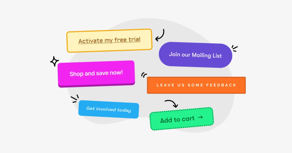
A call to action (CTA) is a short, purposeful prompt that encourages your audience to take a specific step — like buying a product, signing up for a newsletter, or clicking a link. Whether it’s a button on a CTA landing page or a link in an email, it guides people toward your goal.
At its core, a CTA turns passive viewers into active participants. Instead of just browsing, your visitors now act: they click, subscribe, download, or buy. That’s what makes a good call to action so powerful — it removes guesswork and tells users exactly what to do next.
Effective CTAs create urgency, offer value, and make the next step feel simple. From boosting conversions to growing your email list, the right CTA is one of the most important tools in your marketing playbook.
Why CTAs Matter in Every Channel (And What Happens Without Them)
CTAs (Calls to Action) are essential in all marketing channels. Whether it’s on your website, in an email, or across social media, a strong CTA shows your audience exactly what to do next. It might ask them to buy a product, sign up for a newsletter, or follow your brand. Without a clear CTA, users often leave without taking action. That means lost leads, fewer conversions, and missed sales.
The best call to action buttons guide visitors through your content with purpose. They make your messaging more effective by removing confusion and creating a natural flow. CTAs also improve user experience, reduce bounce rates, and provide valuable data through clicks and engagement. When used consistently, they help build trust and loyalty.
Why CTAs are important
- They drive conversions by encouraging users to act right away
- They increase engagement by turning passive visitors into active participants
- They support your sales funnel at every stage of the customer journey
- They make your content measurable and trackable
- They strengthen your brand when used with consistency and clarity
Without CTAs, your content can feel unfinished or directionless. A visitor may be interested but leave simply because they are unsure what to do next. That is why strong CTA ideas are not just helpful. They are critical to your marketing success.
Only CTA cannot drive action, take a look at our article of: Customer Experience Marketing: 6 Strategies for Brand Loyalty
9 Types of CTAs You Should Know
All CTAs aim to get users to take action, but the wording can change depending on the goal. Marketers often get creative with their CTA button text to stand out and boost results.
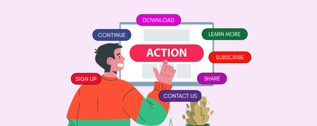
Below are common types of CTAs used across marketing channels, along with example phrases for each.
CTA Type | Purpose | Example Phrases |
Direct Response | Prompt immediate action | Buy now, Download today, Subscribe |
Informational | Encourage learning or awareness | Learn more, Read our blog, Watch the webinar |
Social Sharing | Boost organic reach | Share on Facebook, Tweet this, Pin it |
Feedback & Review | Collect user opinions or testimonials | Leave a review, Rate your experience |
Personalized | Match user behavior or preferences | Recommended for you, Unlock your offer |
Lead Generation | Collect emails or contact info | Request a demo, Sign up for updates |
Time-Sensitive | Create urgency or scarcity | Limited time offer, Act now |
Exit-Intent | Recover abandoning visitors | Wait, get 10% off before you go |
Secondary | Offer a softer alternative | Learn more, Subscribe for updates |
A Full List of 40+ Call to Action Examples
1. Software & SaaS CTA examples
For software and SaaS businesses, the right call to action isn’t just about prompting a signup. It’s about guiding potential users toward trying, learning, or booking, in ways that build trust and reduce friction. Whether you offer a free tool, a paid demo, or ongoing services, these call to action website examples showcase how to lead users to the next step with clarity and confidence.
Below are real-world call to action button examples used by software brands to boost conversions, encourage trials, and build lasting user relationships.
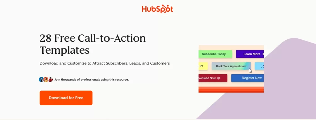
1. HubSpot – Download for Free
This CTA works because it delivers exactly what the user wants: free templates. Rather than saying “Download Now” or “Access Free Tools,” HubSpot’s button is personalized and specific: “Download for Free”. It’s action-driven and clearly aligned with the content promise.
- Why it works: Personalized, benefit-focused, and results-oriented.
- Use case: Offering free marketing resources or downloads.
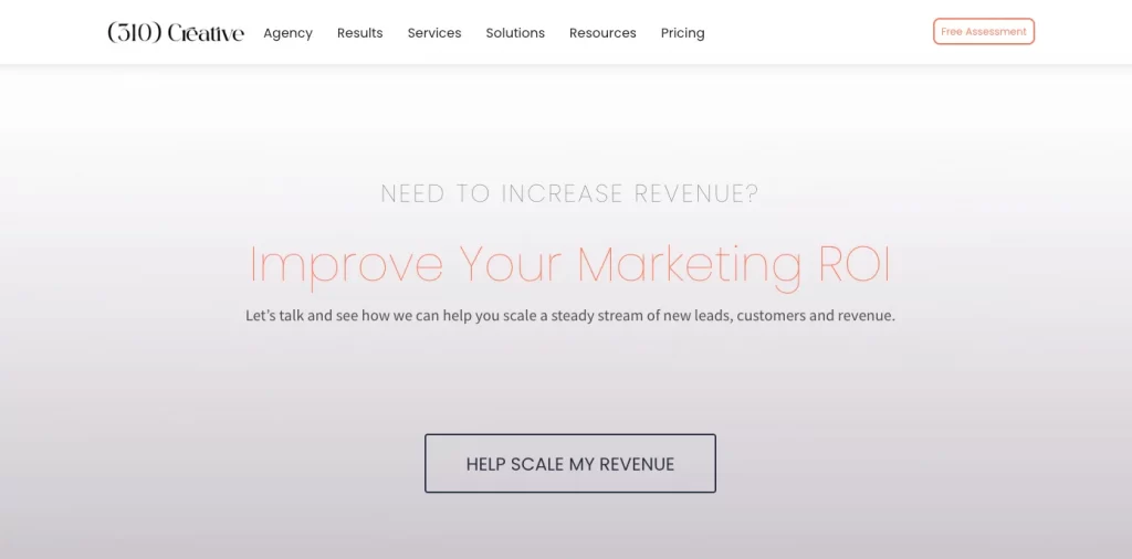
2. 310 Creative – Help Scale My Revenue
Instead of a vague “Learn More” or “Contact Us,” 310 Creative focuses on empathy and outcome. This CTA speaks directly to the business owner’s goal: to grow revenue and positions the agency as a growth partner.
- Why it works: Clear value proposition and user-focused copy.
- Use case: Service-based agencies or B2B SaaS providers.
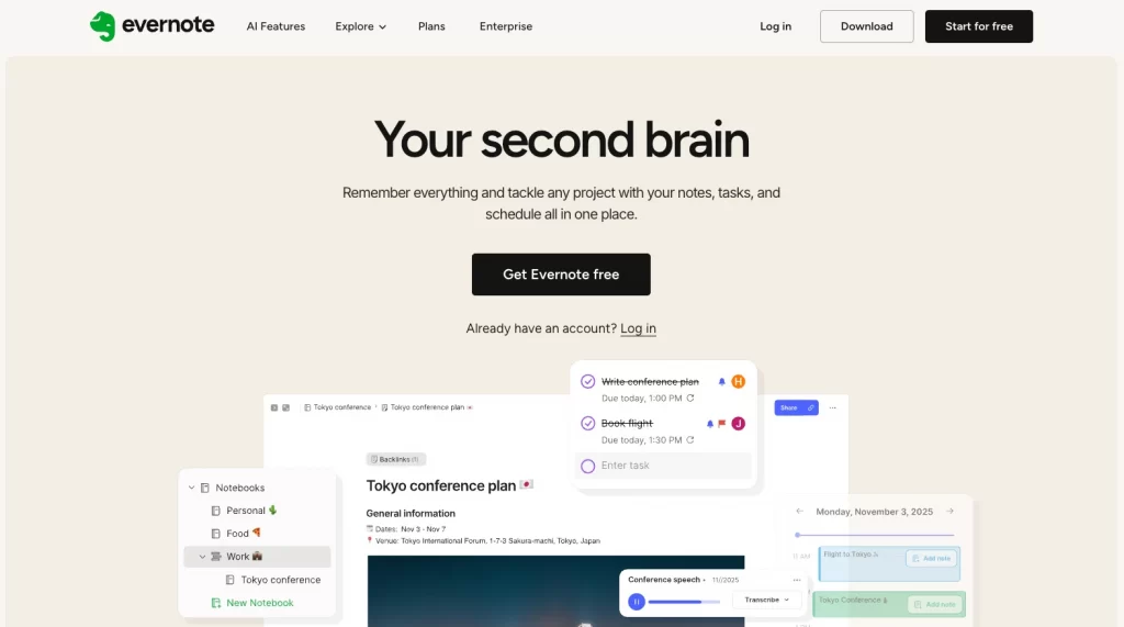
3. Evernote – Get Evernote Free
Evernote uses a classic freemium CTA, but what makes it stand out is its strong design and minimal wording. The CTA pops visually with a bold green button and is reinforced with messaging like “What will you achieve today?” which adds motivational context.
- Why it works: Simple, visually effective, with a low barrier to entry.
- Use case: Freemium models and productivity tools.
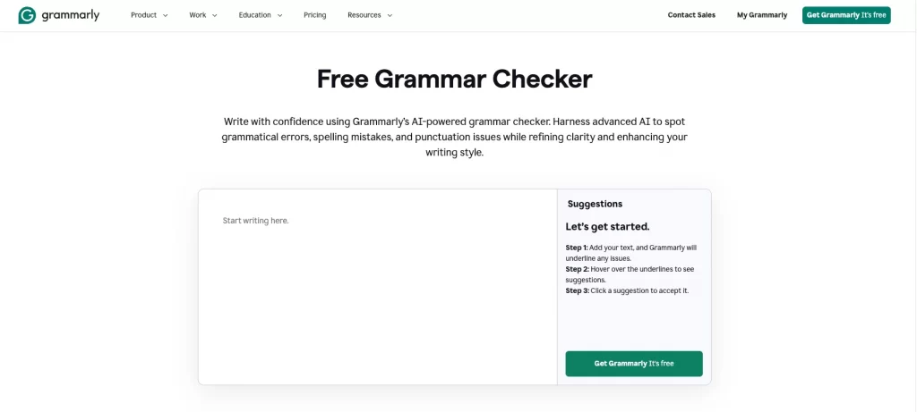
4. Grammarly – Get Grammarly. It’s free
Grammarly enhances the basic “Sign up” with a clear benefit: no cost. The added period makes it feel more conversational and confident. For extra ease, Grammarly also offers a second option: Sign up with Google.
- Why it works: Builds trust, removes friction, and feels easy to act on.
- Use case: Tools that benefit from mass adoption or free-tier models.
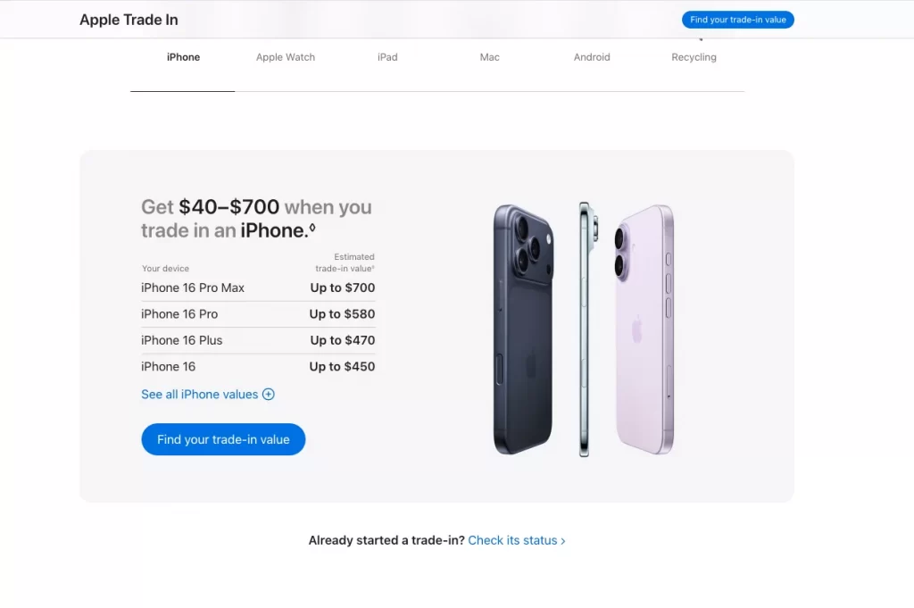
5. Apple – Find your trade-in value
Apple personalizes its CTA by using second-person language: your trade-in value, instead of a cold “Calculate Now.” It taps into curiosity while making the action feel low-pressure and customized.
- Why it works: Personal, curiosity-driven, and user-centric.
- Use case: Trade-in tools, product configurators, or pricing calculators.
6. Full Bundle – Our Work
Instead of “See Portfolio,” Full Bundle keeps it simple and conversational. Our Work feels like an invitation and fits naturally with the dark, minimal design. The button is surrounded by white space, helping it stand out — a smart use of CTA design best practices.
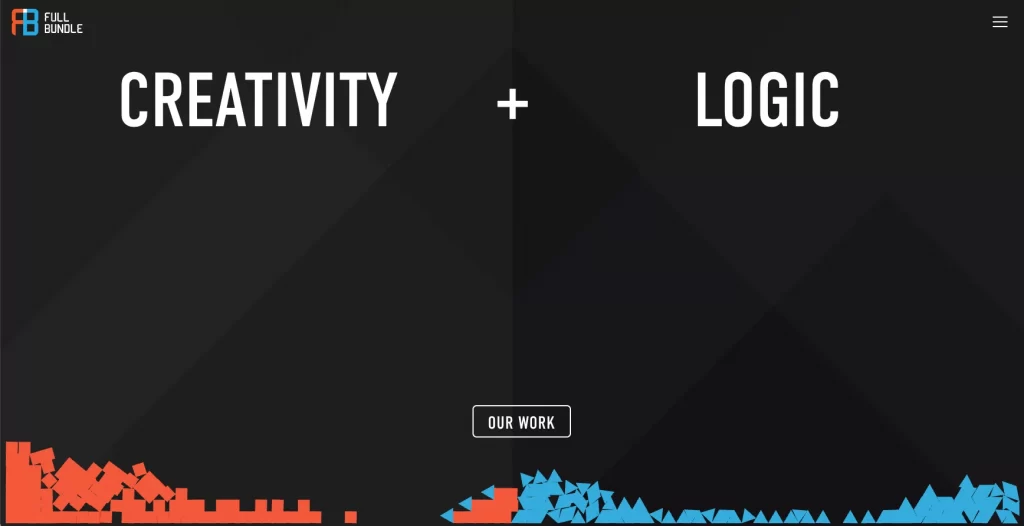
- Why it works: Clean, confident, and well-placed.
- Use case: Design, dev, and creative agencies.
7. EPIC – Start a New Project With Us
Rather than a pushy “Hire Us” or “Submit Request,” EPIC uses friendly, collaborative language: Start a New Project With Us. It makes the CTA feel like a conversation starter, which fits the agency’s branding.
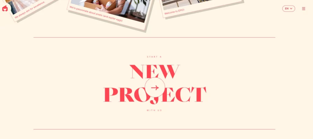
- Why it works: Inclusive tone and inviting phrasing.
- Use case: Agencies, consultants, or custom services.
8. IMPACT Branding – Schedule a Call
“Schedule a Call” replaces formal language like “Contact Us” with a warm, approachable CTA. It signals that the conversation will be two-way and human. This small change transforms the tone of the entire page.
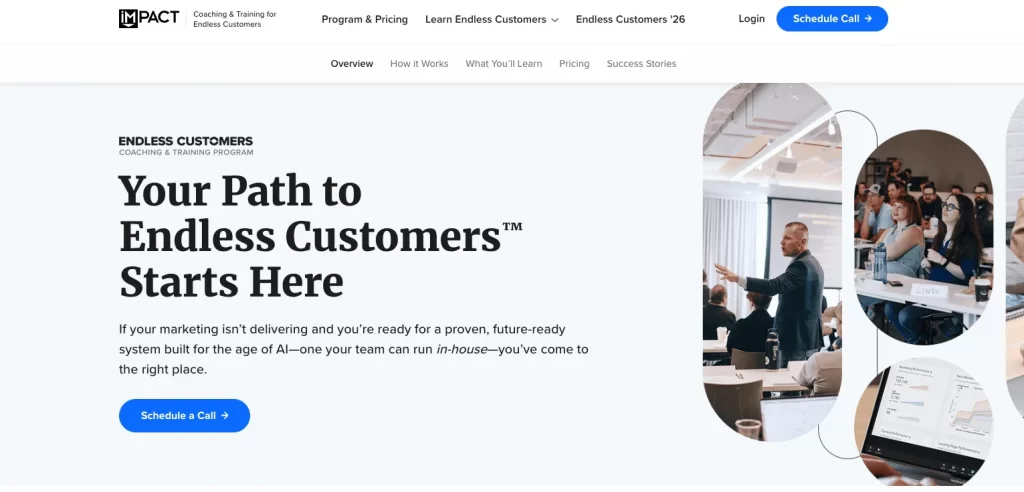
- Why it works: Relational, informal, and customer-first.
- Use case: Client-facing service businesses or strategy firms.
Takeaway: Effective CTAs for software and SaaS aren’t always about selling, they’re about removing barriers. Whether you’re offering a free trial, a helpful resource, or a consultation, use direct verbs, benefit-oriented language, and a human tone. Then, back it up with strong button design and strategic placement.
2. Streaming service CTA examples
CTAs are key to turning streaming platform visitors into subscribers. With free trials, bundle deals, and urgency-driven offers, strong CTAs must reduce hesitation and highlight value. Below are real-world call to action button examples from top streaming brands, also great call to action website examples for any subscription-based service.
1. Hulu – Get This Offer
Hulu taps into a combo of promotion and urgency with the CTA “Get This Offer”. The copy is paired with visuals of the Disney+ bundle offer, giving the user a sense of exclusivity and value. The blue button stands out clearly against the darker background, drawing the eye toward the action.
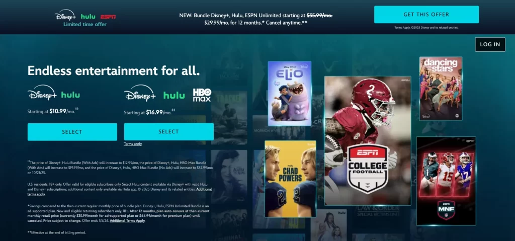
- Why it works: Highlights a limited-time offer and suggests added value without saying “Sign Up.”
- Use case: Promotions, upsells, or bundled subscriptions.
2. Tidal – Start Free Trial
Tidal takes a bold, confident approach with Start Free Trial. Unlike softer phrases like “Try it free,” this CTA commands action. It’s assertive but low-risk, and the surrounding gold-toned background supports the brand’s premium positioning.
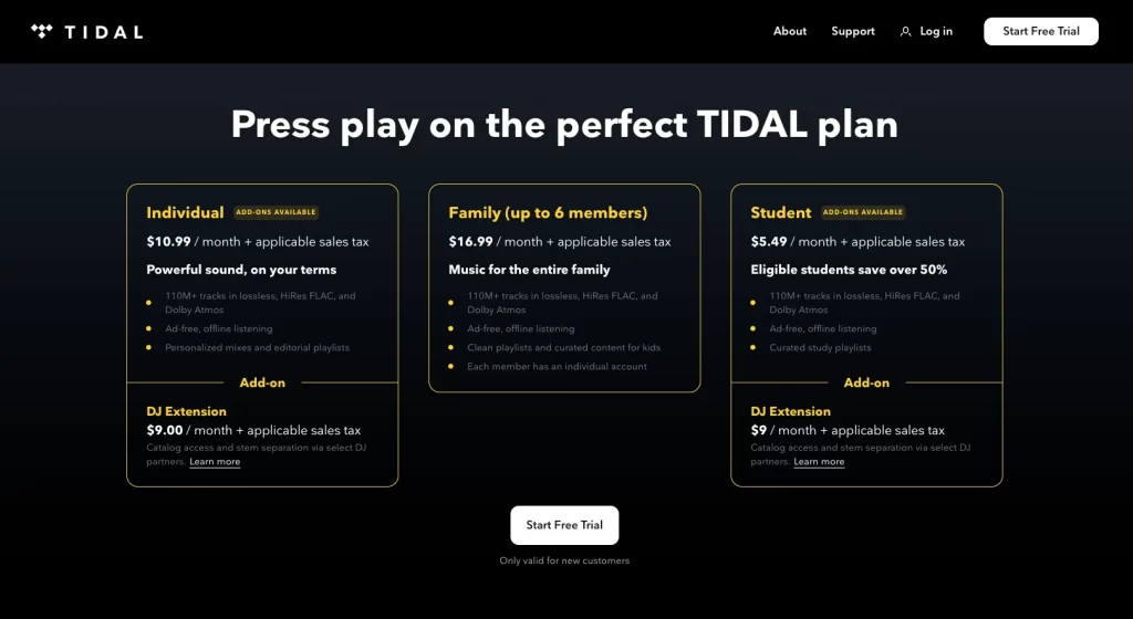
- Why it works: Uses a strong action verb and avoids friction.
- Use case: Premium services offering limited trials.
3. Netflix – Get Started
Netflix removes purchase anxiety by pairing its Get Started CTA with a reassuring message: “Cancel anytime.” This is a smart tactic for lowering perceived risk. The CTA itself is friendly and non-pushy, making users feel comfortable to take the first step without commitment.
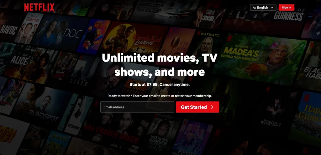
- Why it works: Reduces friction and builds trust.
- Use case: Entry-level or free plans with a flexible cancellation policy.
4. SoundCloud – Try It Free for 30 Days
SoundCloud promotes its premium service (Go+) with this clear, benefit-rich CTA: Try it free for 30 days. This not only shows exactly what the user gets, but it also implies urgency. The button is reinforced by copy that highlights exclusive access and ad-free listening.
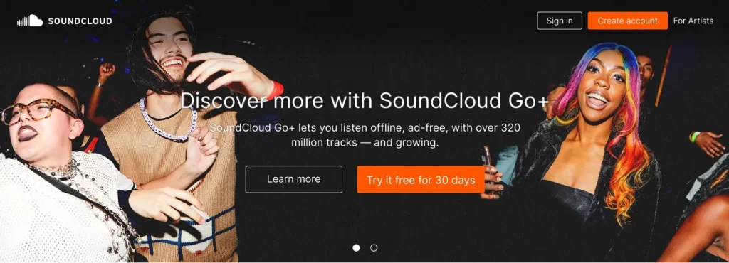
- Why it works: Combines value, time-limit, and clarity in one line.
- Use case: Trials for paid upgrades or gated content access.
Takeaway: CTAs for streaming services should be actionable, benefit-driven, and time-sensitive. Words like start, get, try, or claim work well when paired with trial lengths or promotions. Reinforce your CTA with a trust signal like cancel anytime or no credit card required to remove hesitation.
3. Retail & eCommerce call to action examples
In ecommerce, calls to action must do more than guide clicks. They need to inspire purchases. From homepage buttons to product detail pages, the CTA signals what action to take and why. The most effective CTAs emphasize value, personalization, and ease. Good design and placement make them even more powerful.
The examples below include strong landing page call to action examples used by top consumer brands. Many of these also work as B2B call to action examples for platforms with wholesale catalogs, customized orders, or incentive-driven offers.
1. Glossier – Claim Offer
This CTA uses emotional framing to spark action. The phrase “You deserve it” appears just above the button, making Claim Offer feel like a reward. The button leads to a form that unlocks a discount, but the user has to click first to see the deal.
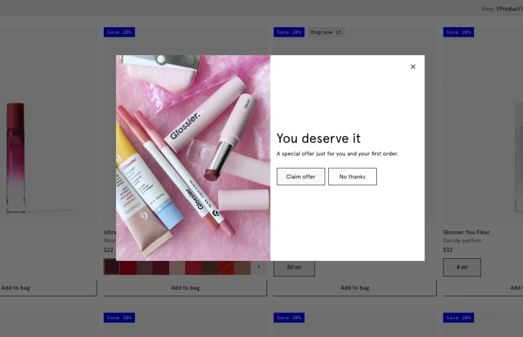
- Why it works: Personal and benefit-focused
- Best for: Discount offers or subscriber-only promos
The CTA is very effective when you want to sell up or cross-sell some of your items. Have you heard about this term? Check out what is cross-promotion: strategies, types, and real examples (2025).
2. Diptyque – Add to Bag / Discover [Product]
Diptyque uses a two-button CTA strategy to match different shopper mindsets.
- Add to Bag helps ready-to-buy users act fast
- Discover Citrouille (Pumpkin) invites more curious users to explore a featured scent
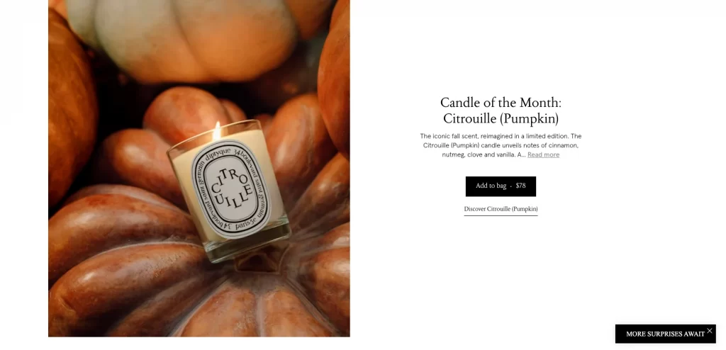
This allows the brand to reduce bounce while supporting deeper product engagement.
- Why it works: Supports both quick buys and product discovery
- Best for: Homepage product highlights or featured collections
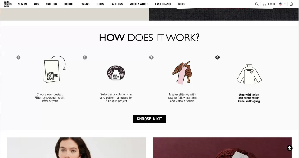
3. Wool and the Gang – Choose a Kit
This CTA is highly personalized. Instead of “Shop Now,” it invites users to Choose a Kit. It aligns with the brand’s DIY approach and is supported by a simple graphic showing how the kits work. This feels like an experience, not just a transaction.
- Why it works: Encourages creative control and customization
- Best for: Product bundles, personalized orders, or gift sets
4. Madewell – See the [Collection] / Shop the Edit
Madewell links lifestyle storytelling with shopping.
- See the Story builds interest through brand narrative
- Shop the [collection] turns inspiration into product discovery
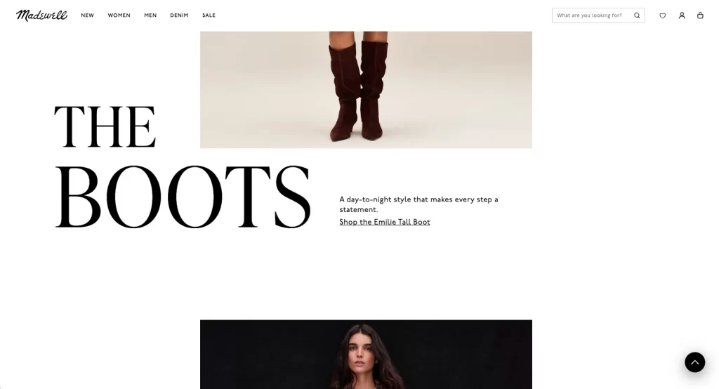
By guiding users through both story and store, the CTAs support engagement and conversion.
- Why it works: Connects emotion and action
- Best for: Campaign pages, lookbooks, or limited collections
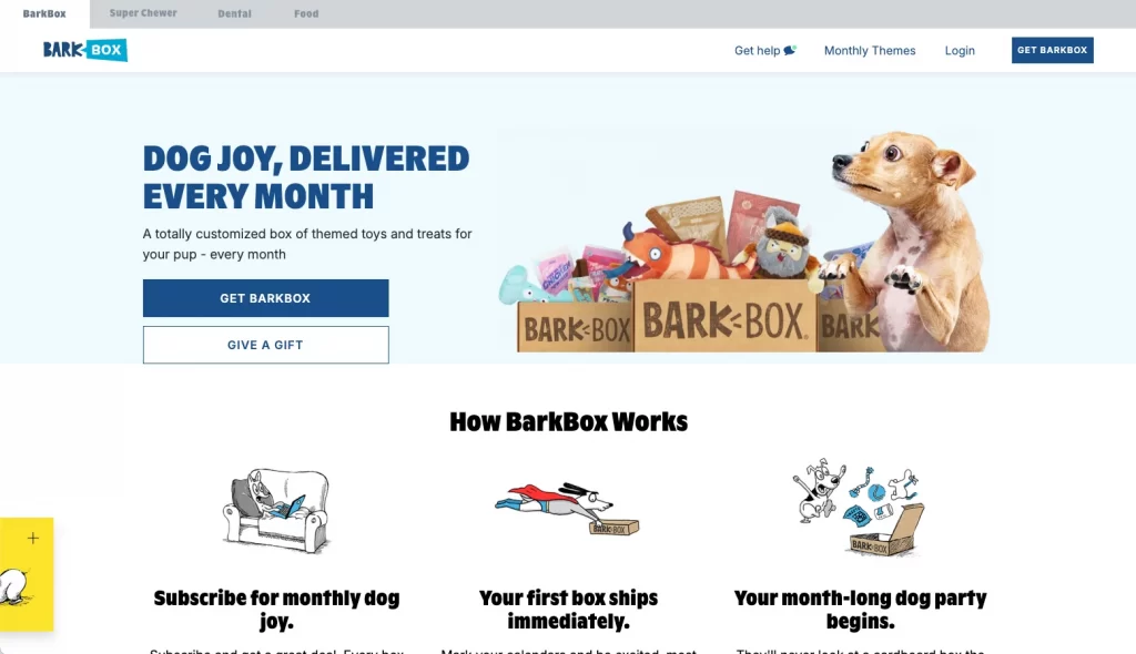
5. Barkbox – Get Barkbox
Instead of overwhelming users with multiple CTA options, Barkbox repeats the same button — Get Barkbox — across the homepage. This keeps the focus on one action. Research shows that using one CTA per page can significantly boost conversions.
- Why it works: Repetition reinforces action
- Best for: Subscription boxes and DTC product flows
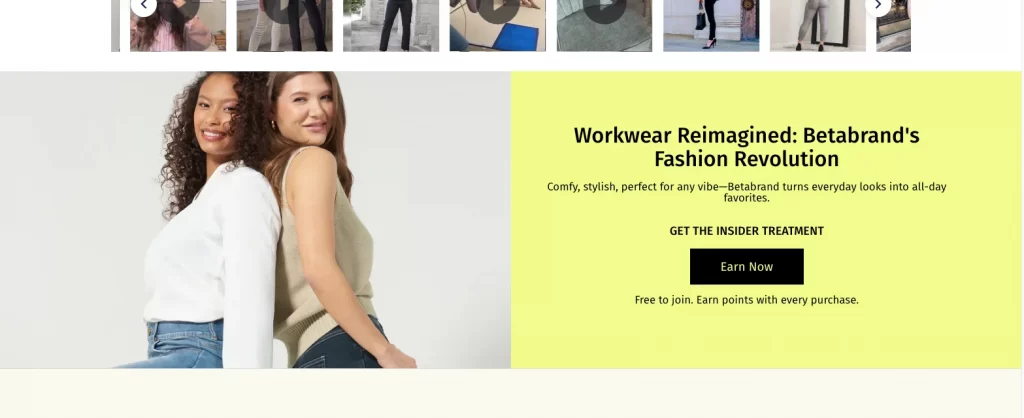
6. Betabrand – Earn Now
Rather than “Join Now” or “Sign Up,” Betabrand uses Start Earning. This phrasing shifts the focus from completing a task to gaining a benefit. It frames the loyalty program as something valuable and active, not passive.
- Why it works: Makes the offer feel immediate and rewarding
- Best for: Loyalty programs, B2B affiliate programs, or rewards pages
Takeaway: Retail and eCommerce CTAs work best when they are clear, benefit-led, and tailored to user intent. Whether you are appealing to impulse buyers or curious browsers, words like Claim, Start, and Choose put the focus on the user’s action and reward.
These call to action button examples can easily adapt to landing pages, product pages, and even B2B incentive flows.
4. Travel, hospitality, & lifestyle CTA examples
In travel, lifestyle, and hospitality, the best CTA examples invite users to imagine an experience rather than make a transaction. These brands use emotionally driven copy, clean visuals, and subtle urgency to encourage action. The goal is to inspire exploration, not pressure commitment.
Each of the following CTA landing page examples demonstrates how to create engagement through tone, design, and intent — helping users take the next step with confidence and curiosity.
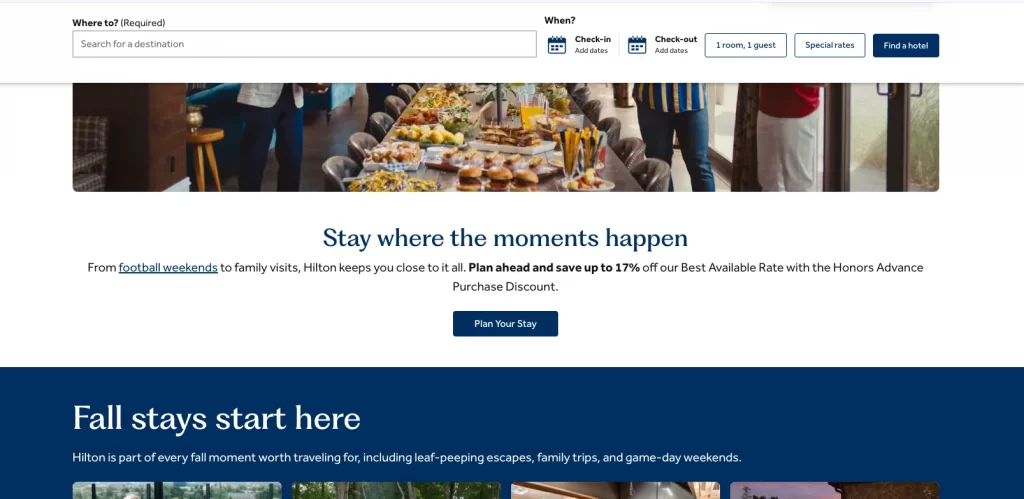
1. Hilton – Plan Your Stay
Hilton replaces inspiration with action through the CTA Plan Your Stay. It speaks directly to travelers who are ready to take the next step, offering guidance rather than pressure. The phrase feels personal and supportive, matching Hilton’s brand tone of hospitality and care. Instead of demanding a booking, it helps users start organizing their experience with ease.
- Why it works: Action-oriented, friendly, and aligned with traveler intent
- Best for: Hotel booking pages, destination microsites, or trip-planning content
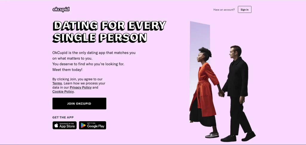
2. OkCupid – Join OkCupid
OkCupid’s CTA is simple yet powerful. Join OkCupid removes all complexity and feels safe and welcoming. It avoids the intensity of “Sign Up Now,” instead presenting the first step as easy and low-pressure.
- Why it works: Reduces user hesitation through simplicity
- Best for: Membership sites, dating apps, or community platforms
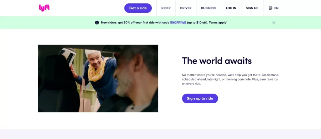
3. Lyft – Sign Up to Ride
Lyft separates its audience with two clear CTAs: Sign Up to Ride and Apply to Drive. This clarity helps both customer types feel directly addressed. The CTA design also supports accessibility with bright color contrast for quick scanning.
- Why it works: Straightforward, inclusive, and audience-specific
- Best for: Service marketplaces, apps, or two-sided platforms
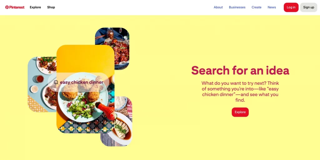
4. Pinterest – Explore
Pinterest captures its essence perfectly with one word: Explore. The CTA reflects the platform’s purpose and makes the action feel creative and spontaneous. It’s not about signing up; it’s about starting a visual journey.
- Why it works: Short, intuitive, and perfectly aligned with the brand identity
- Best for: Content discovery, inspiration-based platforms, or creative tools
5. Nonprofit & cause-driven CTA examples
In the nonprofit world, a call to action must connect heart and purpose. These organizations rely on emotion, trust, and shared values to drive participation. The most effective call to action examples in writing use powerful verbs and empathetic language that invite people to be part of something bigger rather than simply donate.
Each example below demonstrates how mission-driven CTAs can spark engagement, mobilize communities, and strengthen long-term support.
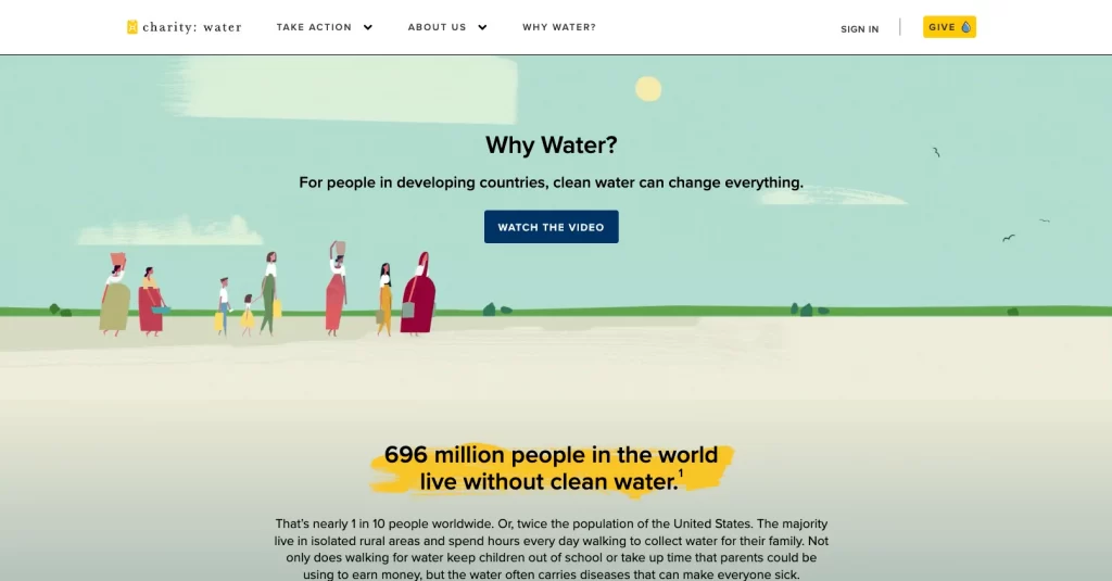
1. charity: water – Give 💧
charity: water simplifies its mission beautifully with the CTA Give 💧. The water droplet emoji adds a personal and visual touch, making the act of giving feel tangible and immediate. Instead of saying “Donate,” the message centers on the impact — giving clean water to those in need.
- Why it works: Uses symbolism and simplicity to humanize the action
- Best for: Donation campaigns and impact storytelling
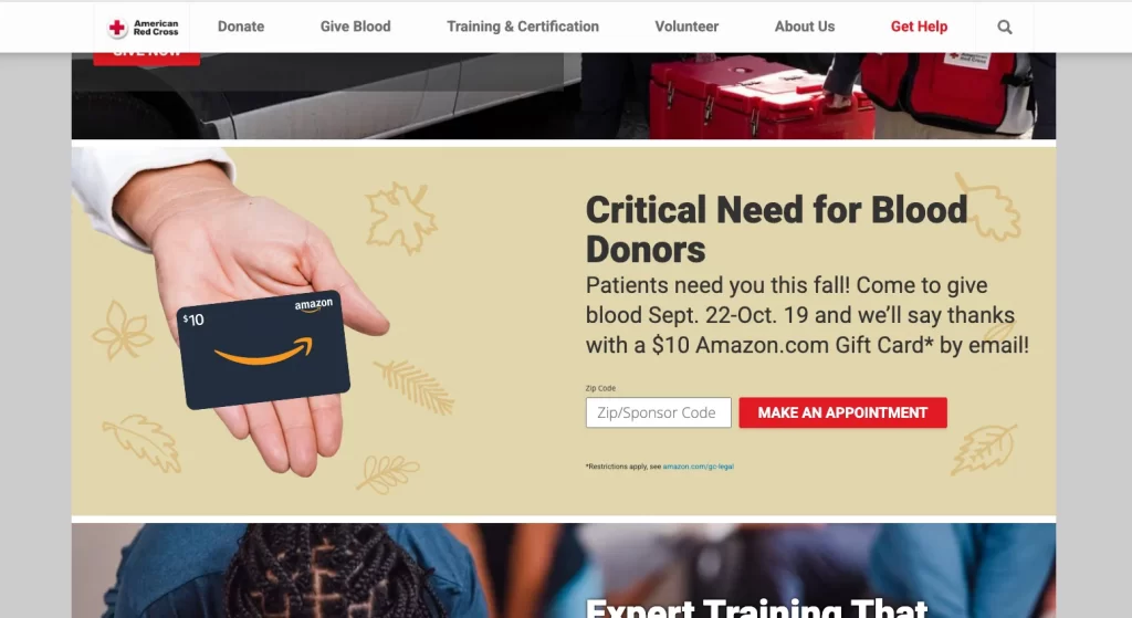
2. American Red Cross – Make an Appointment
The American Red Cross creates urgency without pressure through Make an Appointment. It replaces “Learn More” with an action-oriented phrase that conveys importance and timeliness. This CTA makes participation feel easy and necessary — a small step toward saving lives.
- Why it works: Combines immediacy with clarity and purpose
- Best for: Volunteer sign-ups, blood drives, or event participation
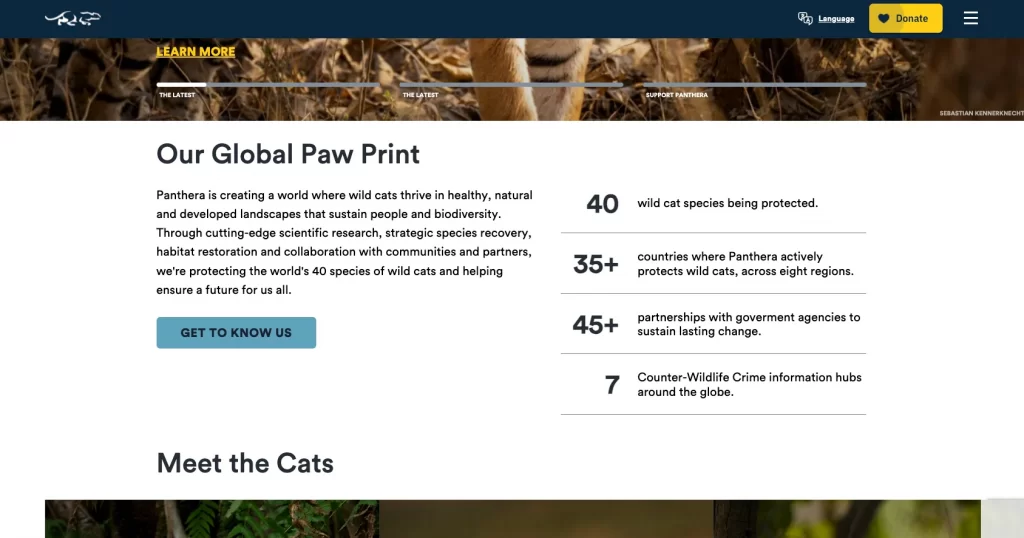
3. Panthera – Get to Know Us
Panthera takes a relationship-first approach with Get to Know Us. It’s softer than “Join Now” and invites readers to learn about the mission before committing. This CTA builds transparency and trust, key factors in donor decision-making.
- Why it works: Builds familiarity and removes hesitation
- Best for: Awareness campaigns and donor onboarding pages
5. Feeding America – Join the Movement
Feeding America reframes giving as collective impact with Join the Movement. It shifts focus from transaction to participation, showing supporters that they’re contributing to something larger. The phrase energizes and empowers action.
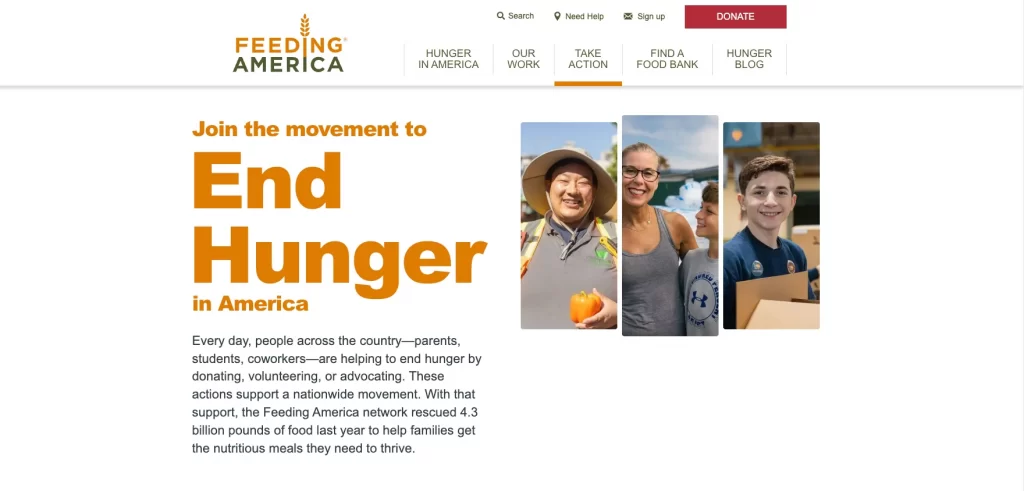
- Why it works: Inspires unity and social purpose
- Best for: Fundraising campaigns or advocacy initiatives
Takeaway: Nonprofit CTAs thrive on emotional appeal, clarity, and belonging. Instead of generic terms like Donate or Submit, focus on words that evoke empathy and shared purpose, such as Give, Join, or Get Involved. When writing your call to action examples in writing, emphasize the impact rather than the instruction.
6. Social media call to action examples
On social media, a strong call to action can turn a scroll into a click. Whether it’s a Facebook carousel, an Instagram reel, or a TikTok ad, effective CTAs must grab attention fast and guide users toward instant action.
The best call to action advertising examples combine clear intent, emotional appeal, and design that fits naturally into the platform experience.
These CTA button examples show how brands tailor their language to suit user behavior and content flow across three major platforms.
1. Facebook ad CTA examples
Facebook ads often rely on short, benefit-driven copy paired with visual social proof — ratings, testimonials, or user results — to build trust before the click.
1.1. Heyday – Book Now
Heyday’s ad features real client photos and testimonials alongside the Book Now CTA. The phrase feels direct yet approachable, perfect for a service-based brand where action equals appointment.
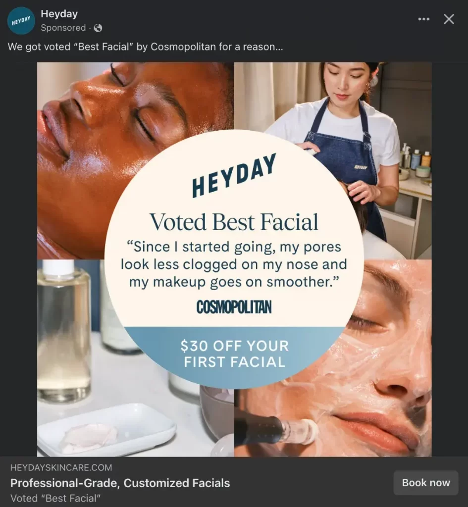
- Why it works: Simple action with a clear benefit
- Best for: Appointment-based businesses or personal services
1.2. Joybird – Shop Now
Joybird adds urgency to the classic Shop Now CTA by pairing it with “Limited time offer” and “SALE” text in all caps. The timing cue encourages quick action without needing extra explanation.

- Why it works: Combines urgency with visual appeal
- Best for: Retail ads, seasonal sales, or product launches
1.3. The NYT Cooking – Learn More
The New York Times Cooking uses Learn More to lead users to a recipe tip rather than a sales pitch. It builds curiosity, positioning content as the first step before conversion.
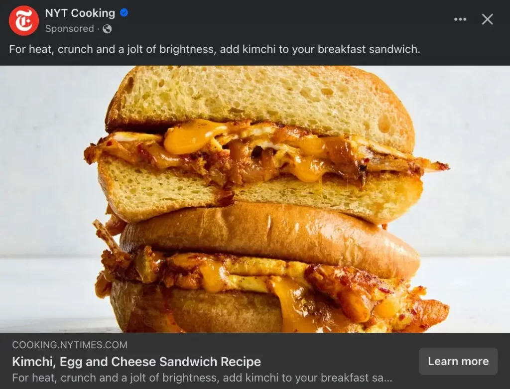
- Why it works: Educational and low-pressure
- Best for: Content marketing or subscription upsells
1.4. The Farmer’s Dog – Get Offer
The Farmer’s Dog frames its message as a reward rather than a request. Get Offer feels inviting and value-driven, especially with 50% off for first-time subscribers.

- Why it works: Adds exclusivity and value appeal
- Best for: Subscriptions, limited deals, or introductory promotions
2. Instagram ad CTA examples
Instagram ads often feel more organic, blending visuals, motion, and tone with subtle CTA placement. These call to action examples prove that social CTAs can drive conversions without disrupting the user experience.
2.1. Aperol Spritz – Sign Up
Aperol Spritz uses Sign Up for a Coachella-themed giveaway campaign. The CTA fits seamlessly into the event-based post, making participation feel quick and exciting.
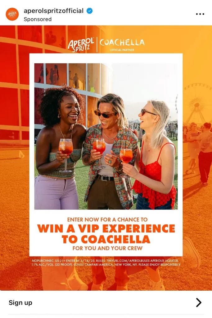
- Why it works: Connects sign-up with reward and exclusivity
- Best for: Event registrations, contests, or email lead forms
2.2. Kalshi – Install Now
Kalshi’s minimalist ad shows real trading outcomes with a single Install Now CTA. It sets expectations clearly, inviting users to act without unnecessary details.
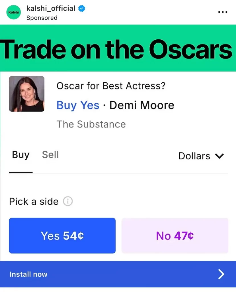
- Why it works: Clear purpose and instant gratification
- Best for: App installs or mobile-first platforms
2.3. Equinox – Learn More
Equinox uses Learn More across its Instagram Stories to invite discovery rather than push sign-ups. The repetition builds familiarity while matching the brand’s premium tone.

- Why it works: Fits luxury tone and nurtures curiosity
- Best for: High-end services or aspirational campaigns
2.4. Archero 2 – Play Game
Archero 2’s CTA Play Game matches the ad’s gameplay preview, giving users a fun, instant action to take. It’s simple but perfectly suited to mobile gaming audiences.

- Why it works: Direct, engaging, and aligned with creative content
- Best for: Gaming, entertainment, or app demos
3. TikTok ad CTA examples
TikTok CTAs succeed when they match the platform’s tone — authentic, creator-driven, and emotionally relevant. The following call to action advertising examples use this formula effectively.
3.1. Coach – Shop Now
Coach uses Shop Now in clean, elegant TikTok ads that highlight its products through creator partnerships. The CTA is familiar but polished, helping the brand maintain luxury appeal.
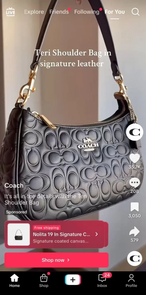
- Why it works: Classic, polished, and consistent
- Best for: Product-driven brands or influencer collaborations
3.2. Nourish – View Now
Nourish chooses View Now to encourage users to explore coverage options before committing. The CTA feels casual yet purposeful, perfect for healthcare-related content.

- Why it works: Builds trust through a low-pressure approach
- Best for: Informational or regulated industries
3.3. Starbrew Cafe – Check It Out
This gaming brand uses Check It Out to match its cozy, creative ad tone. The relaxed phrasing encourages curiosity without sales pressure.
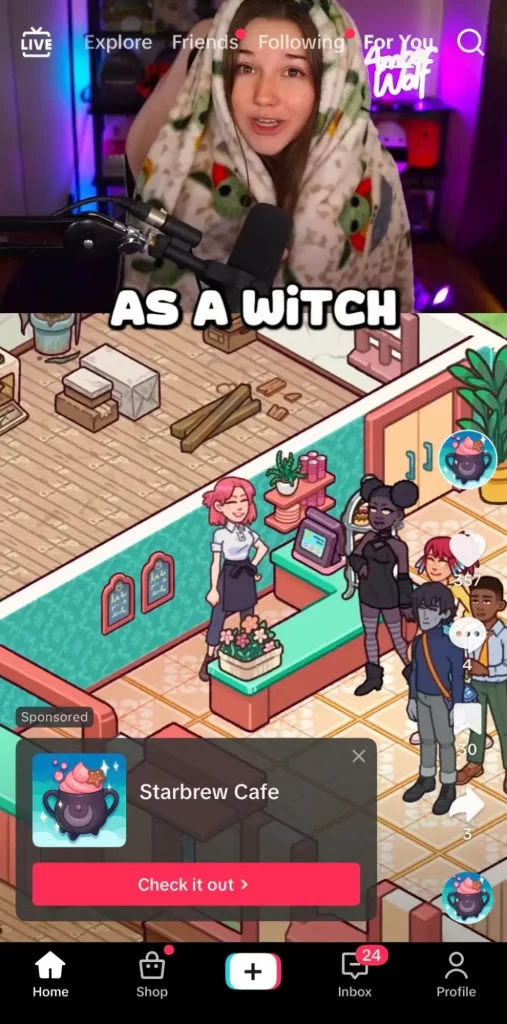
- Why it works: Inviting and conversational
- Best for: App games, entertainment, or soft-sell ads
3.4. BetterHelp – Learn More
BetterHelp uses Learn More to maintain sensitivity in mental health marketing. The CTA feels safe and supportive rather than sales-driven.
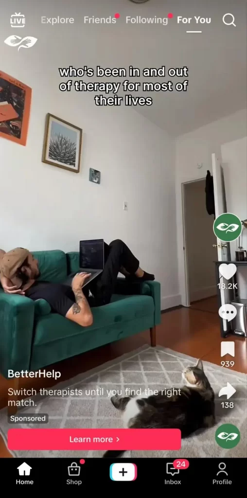
- Why it works: Respectful, human, and trust-building
- Best for: Services requiring empathy or personal decision-making
3.5. Verizon – Order Now
Verizon’s Order Now CTA is bold but risks being too aggressive for social audiences. It demonstrates the importance of matching tone with price point and platform.

- Why it works (and doesn’t): Clear but lacks contextual warmth
- Best for: High-intent campaigns with clear purchase readiness
Takeaway: Social media CTAs succeed when they fit platform tone, audience intent, and visual context. On Facebook, clarity and proof build trust. On Instagram, tone and storytelling drive connection. On TikTok, authenticity and relatability win. When crafting your CTA button examples, aim for natural language that fits the medium.
Use verbs like Book, View, Play, and Get to create energy and momentum. The best call to action advertising examples meet users where they are — short attention span, quick decision, high curiosity — and guide them seamlessly toward conversion.
7. Email CTA examples
In email marketing, your call to action is the turning point between a passive reader and an engaged customer. The best call to action marketing examples use concise, branded language that feels natural to the campaign’s tone and purpose. Whether you’re promoting a product, event, or special offer, an effective email CTA must be clear, clickable, and emotionally aligned with your message.
These examples showcase how brands use creativity, tone, and timing to make their CTA button examples stand out in the inbox.
1. Bala – Let’s Play
Bala adds personality to their emails with Let’s Play. It replaces the expected “Shop Now” with something fun, energetic, and true to their brand voice. The CTA pairs perfectly with colorful visuals, making fitness feel approachable and stylish.
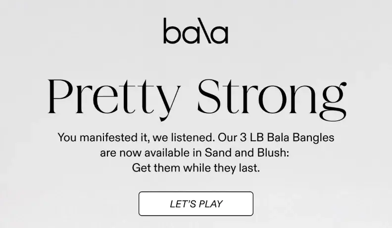
- Why it works: Playful, on-brand, and instantly engaging
- Best for: Lifestyle and fitness product launches
2. OUAI – Beep Beep
OUAI turns a simple product announcement into a creative experience. Their CTA Beep Beep fits seamlessly with a car-themed campaign, reflecting the brand’s humor and casual style. It stands out in the inbox because it feels like a message from a friend, not a sales pitch.
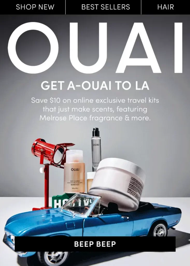
- Why it works: Unique, conversational, and campaign-specific
- Best for: Brand storytelling or themed promotional emails
3. Orangetheory – Claim Your First Month Free
Orangetheory’s email CTA highlights the full offer right in the button. Instead of hiding details in the copy, Claim Your First Month Free communicates value and urgency upfront. The bright orange button reinforces brand identity while grabbing immediate attention.
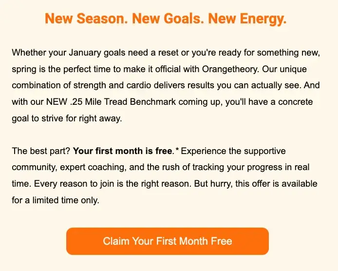
- Why it works: Value-forward and visually consistent
- Best for: Trial campaigns, subscriptions, and limited promotions
4. Kolkata Chai Co. – RSVP For 3/7
Kolkata Chai Co. personalizes event CTAs by including the date directly in the button. “RSVP For 3/7” reminds users of the event and adds subtle urgency. It’s friendly, clear, and fits perfectly in a community-driven campaign.
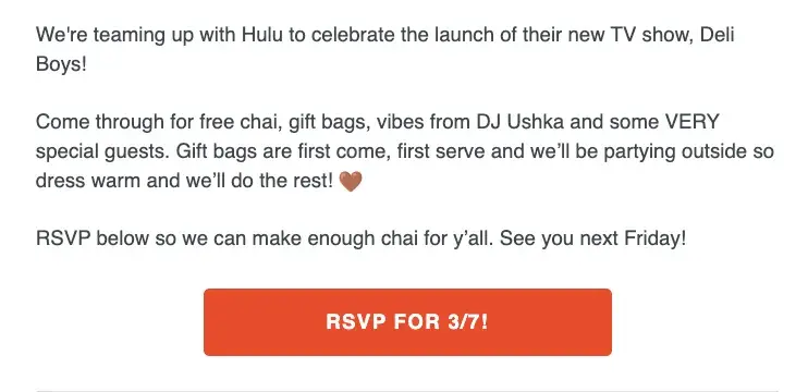
- Why it works: Time-specific, contextual, and community-focused
- Best for: Event marketing, pop-ups, or collaborations
Key takeaways: Email CTAs perform best when they match tone, intent, and design. Short, conversational CTAs like Let’s Play or Beep Beep add brand personality, while value-driven ones like Claim Your First Month Free encourage immediate clicks. When creating your next campaign, treat your email CTA as more than just a button. It’s your invitation to act.
The strongest call to action marketing examples use direct verbs, clear benefits, and a touch of creativity to turn an open email into a real conversion.
8. Weak CTA examples (What not to do)
Even the most recognized brands can make mistakes with their call to action. Weak CTAs often fail because they lack visual contrast, don’t communicate value, or appear out of sync with the platform or audience. Studying these examples helps you understand what not to do and how to refine your own approach.
These real-world cases highlight the importance of clarity, placement, and emotional relevance in every CTA button example.
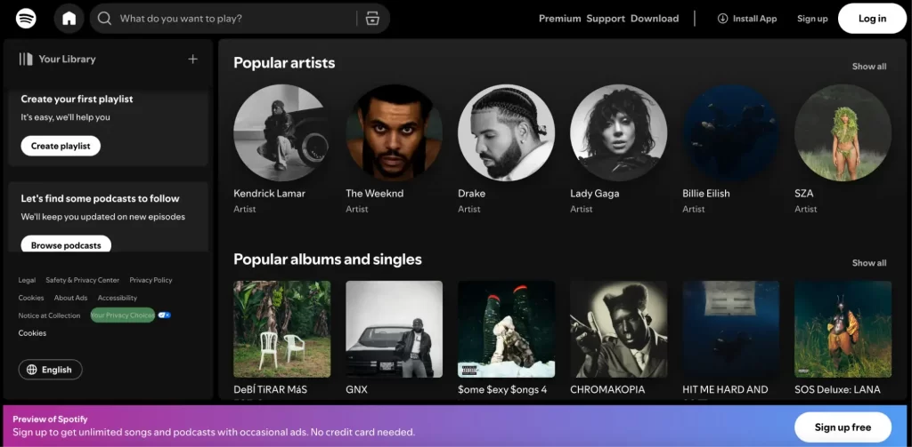
1. Spotify – Sign Up Free (buried placement)
Spotify’s homepage CTA Sign Up Free is technically strong, but poor design placement ruins its impact. The button is small and hidden at the bottom, where many users might miss it. A great CTA loses power when it’s not visually prioritized.
- What went wrong: Weak hierarchy and poor visibility
- Fix it: Move the CTA above the fold and increase contrast
2. Abercrombie – Shop Now (uninspired, not visible)
Abercrombie’s Shop Now CTA blends into the email’s monochrome background. Without color contrast or supporting copy, it looks generic and forgettable. In a crowded inbox, users need a reason and a visual cue to click.

- What went wrong: No visual focus and no unique offer
- Fix it: Add color, urgency, or incentive-based phrasing like Shop the Collection or Get 20% Off Today
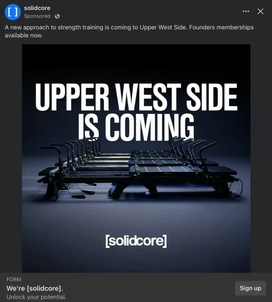
3. [solidcore] – Sign Up (no value shown)
[solidcore]’s Sign Up CTA assumes prior interest, but the ad gives little context or reason to act. On a platform like Facebook, where users scroll casually, the lack of emotional or informational appeal makes the CTA easy to ignore.
- What went wrong: Assumes intent without motivation
- Fix it: Add context, such as Try Your First Class Free or See the Schedule
4. Bed Bath & Beyond – Shop Now (confusing context)
Bed Bath & Beyond’s homepage features Shop Now alongside unclear product messaging. Users might not know what brand or product the button refers to, which creates friction. Generic CTAs without context reduce engagement.

- What went wrong: Misaligned copy and unclear user journey
- Fix it: Use context-driven CTAs like Shop Bath & Rugs or Discover Livabliss Home
5. Verizon – Order Now (too aggressive on expensive item)
Verizon’s TikTok ad used Order Now for a $999 phone. While clear, it feels too direct for a casual platform where users aren’t in a purchase mindset. Aggressive CTAs can backfire when the price or commitment is high.

- What went wrong: Tone mismatch and audience misread
- Fix it: Use softer CTAs like Learn More or See the New Galaxy S25+
Key takeaways: Weak CTAs usually fail for three reasons: poor visibility, vague language, or platform mismatch. A good call to action should always tell users what happens next, highlight value, and look clickable. Avoid generic phrases like Shop Now or Sign Up without context or benefit.
When designing or writing your next CTA, ask yourself: Is it visible? Valuable? And right for this audience? If not, even the best design can’t save a weak message.
Call to Action Best Practices: How to Make a Call to Action
Writing a high-performing CTA isn’t just about choosing the right words. It’s about matching intent, using persuasive language, and guiding users with clarity and purpose. Below are eight proven best practices to help you craft CTAs that convert.
1. Use strong action verbs
Every effective CTA begins with a powerful action verb. These words push your audience toward doing something now — not later. Verbs like “Start,” “Join,” “Get,” or “Explore” make your CTAs feel energetic and direct.
For example, “Discover more” is much more compelling than “Continue.” Strong verbs add momentum and have been shown to increase conversion rates by up to 12.7%.
Different verbs also work better for different goals. Use “Sign up” or “Start free trial” for SaaS. Try “Buy now” or “Add to cart” for ecommerce.
Here are some action-packed words to use in your CTAs:
Sign, Start, Try, Join, Learn, Discover, Explore, Subscribe, Download, Watch, Save, Contact, Shop, Upgrade, Unlock, Activate, Access, Claim, Transform, Elevate, Grow, Optimize, Reserve, Launch
Pro tip: Tailor the verb to your audience segment. A first-time visitor might respond to “Try free”, while a loyal customer may be ready for “Upgrade now.”
2. Create urgency (but be honest)
A well-timed CTA can push users to act quickly, especially when it feels like time is running out. Words like “Now,” “Limited time,” “Last chance,” or “While supplies last” trigger urgency and make people less likely to delay.
For example, instead of saying “Get 20% off,” try “Get 20% off — today only.” This adds pressure in a natural way without sounding too aggressive.
Urgency also plays into FOMO (fear of missing out), which is a powerful emotional trigger in marketing. But be careful not to fake it. False urgency or made-up scarcity can harm your brand’s credibility.
Pro tip: You can boost urgency while building your email list. Use a form CTA like “Be the first to know” or “Get early access” to create a feeling of exclusivity and anticipation.
3. Match CTA to intent (awareness vs purchase)
Your CTA should reflect where the user is in their journey. Someone just learning about your brand won’t respond to the same prompt as someone ready to buy. That’s why aligning your CTA with the intent and stage of the funnel is critical.
For top-of-funnel users, go with soft CTAs like “Learn more”, “Watch the demo”, or “Explore features.” These educate and build trust without pushing too hard.
For bottom-of-funnel users who are ready to convert, use direct CTAs like “Start your free trial”, “Buy now”, or “Get a quote.” These are clear and action-driven, helping users take the final step.
Pro tip: Look at your analytics or customer behavior to segment your audience and deliver different CTAs based on intent. Personalizing your CTA based on where the user is in the decision-making process can significantly improve conversions.
4. Show the benefit, not just the action
Don’t just tell users what to do. Tell them why they should do it. A CTA that highlights the benefit is much more persuasive than one that only gives an instruction.
Compare these two examples:
- Basic CTA: “Subscribe to our newsletter”
- Value-driven CTA: “Subscribe to get weekly tips that grow your business”
The second version explains the benefit, giving users a reason to click. It answers the question, “What’s in it for me?”
To write better CTAs, focus on the outcome or value the user will get. Instead of “Download now”, try “Download the free guide to double your traffic.”
Pro tip: Benefits don’t always have to be big. Even small wins like “Save time,” “Stay updated,” or “Get exclusive access” can make a CTA more appealing.
5. Keep it short and clear
A good CTA is easy to understand at a glance. Long or complicated wording can confuse readers and reduce clicks. The best CTAs use just two to five words, keeping the message focused.
For example, “Join free today” is more effective than “Click here to join our community of members.” Clarity always beats cleverness when your goal is conversion.
Pro tip: Before publishing, read your CTA out loud. If it sounds natural and simple, you are on the right track.
6. Use first or second person (you, me)
Using “you” or “me” in a CTA makes it feel more personal and engaging. It speaks directly to the reader and creates a sense of ownership.
For instance, “Start my free trial” feels stronger than “Start free trial.” Similarly, “Send me updates” is warmer than “Sign up for updates.”
This small shift can make a big difference because it turns a general statement into a personal experience for the user.
Pro tip: Test both first-person and second-person variations. Different audiences may respond better to one over the other.
7. Test different versions (A/B testing tips)
No matter how strong your CTA seems, it’s impossible to know what works best without testing. That’s where A/B testing comes in. By trying out different versions of your CTA, you can see which wording, color, or placement gets the most clicks and conversions.
Try testing:
- Button copy (e.g. “Get started” vs “Start free trial”)
- Color and size
- Placement on the page
- Urgency level (e.g. “Limited time offer” vs “Join now”)
- Personalization (e.g. “Send me tips” vs “Get tips”)
Run one test at a time so you know what made the difference. Even small changes can lead to noticeable improvements.
Pro tip: Use A/B testing tools like Google Optimize, Optimizely, or built-in tools in email marketing platforms to easily compare versions.
8. CTA placement: above the fold, in-scroll, pop-up, exit
Where you place your CTA is just as important as what it says. A well-written CTA can still fail if users don’t see it at the right time.
Here are common placement options:
- Above the fold: Visible immediately when the page loads. Ideal for important or time-sensitive actions.
- In-scroll: Placed within content to appear when users are more engaged. Great for blog posts or guides.
- Pop-ups: Grab attention without requiring users to scroll. Best used sparingly and with value-based offers.
- Exit-intent: Triggered when someone is about to leave the page. Good for last-chance discounts or email signups.
Pro tip: Test multiple placements to see where your audience is most responsive. Sometimes, combining two types (like a top CTA and an exit offer) works best.
FAQs About Call to Action Examples
What is a good call to action example?
A good call to action is clear, specific, and encourages immediate action. It uses strong verbs and highlights a benefit.
Examples: “Start your free trial”, “Get 20% off today”, “Download the free guide”
These CTAs clearly inform users of what they can expect and what to do next.
How do I create a CTA for my website?
Start by deciding what action you want visitors to take, such as signing up or making a purchase. Use an action verb, keep it short, and make sure it stands out visually.
Example: Add a button that says “Shop the collection” or “Subscribe for updates” near your product or content section.
Where should I place my CTA?
CTA placement depends on your content and goals. Common locations include:
– At the top of the page (above the fold)
– Within the content (in-scroll)
– At the end of blog posts
– In pop-ups or exit-intent modals
Always test different placements to see what works best for your audience.
Can I use more than one CTA?
Yes, but keep it focused. You can use multiple CTAs on a page as long as they serve different purposes or are placed strategically. For example, you might have a primary CTA like “Start free trial” and a secondary CTA like “Learn more.”
Too many CTAs in one area can confuse users, so keep the layout clean and the messaging clear.
Start Improving Your CTAs Now!
A strong call to action can turn passive visitors into active customers. In this guide, you learned what CTAs are, why they matter, how to write them effectively, and the different types that drive results. Clear, compelling CTAs help boost engagement, conversions, and sales across all your channels.
If you’re selling on platforms like Shopify, Etsy, or Amazon, LitCommerce makes it easy to manage product feeds, sync listings, and grow through multichannel selling. Combine powerful CTAs with the right tools, and you’re set up for success.
Start improving your CTAs — and let LitCommerce handle the rest.

